Bootstrap 流体布局
在本教程中,您将学习如何使用 Bootstrap 创建流畅的布局。
使用 Bootstrap 创建流体布局
在 Bootstrap 中,您可以使用类 .container-fluid 创建流体布局,以在所有设备尺寸(超小、小、中、大和超大)上利用 100% 的视口宽度。
.container-fluid 类只是应用 width: 100% 而不是针对不同视口大小的不同宽度。 但是,布局仍会响应,您可以照常使用网格类。 请参阅 Bootstrap 网格系统 上的教程以了解有关网格类的更多信息。
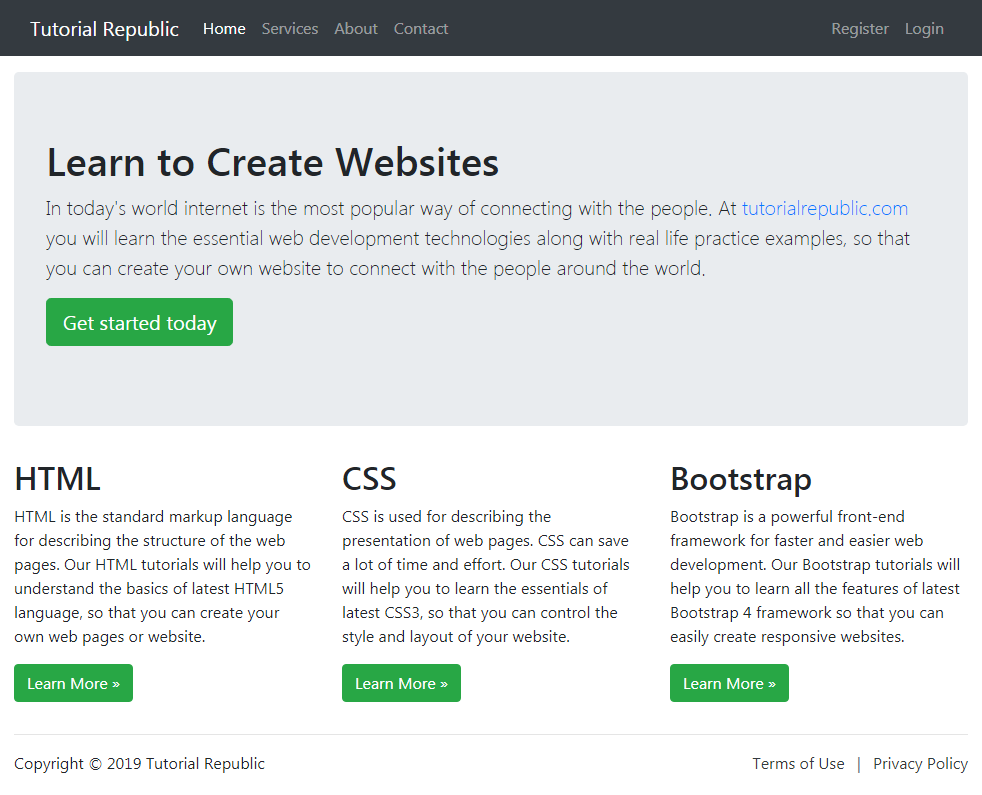
以下示例将创建一个覆盖 100% 屏幕宽度的流体布局。
<!DOCTYPE html>
<html lang="en">
<head>
<meta charset="utf-8">
<meta name="viewport" content="width=device-width, initial-scale=1, shrink-to-fit=no">
<title>Bootstrap 4 Fluid Layout Example</title>
<link rel="stylesheet" href="css/bootstrap.min.css">
<script src="http://code.jquery.com/jquery-3.3.1.min.js"></script>
<script src="js/bootstrap.min.js"></script>
</head>
<body>
<nav class="navbar navbar-expand-md navbar-dark bg-dark mb-3">
<div class="container-fluid">
<a href="#" class="navbar-brand mr-3">Tutorial Republic</a>
<button type="button" class="navbar-toggler" data-toggle="collapse" data-target="#navbarCollapse">
<span class="navbar-toggler-icon"></span>
</button>
<div class="collapse navbar-collapse" id="navbarCollapse">
<div class="navbar-nav">
<a href="#" class="nav-item nav-link active">Home</a>
<a href="#" class="nav-item nav-link">Services</a>
<a href="#" class="nav-item nav-link">About</a>
<a href="#" class="nav-item nav-link">Contact</a>
</div>
<div class="navbar-nav ml-auto">
<a href="#" class="nav-item nav-link">Register</a>
<a href="#" class="nav-item nav-link">Login</a>
</div>
</div>
</div>
</nav>
<div class="container-fluid">
<div class="jumbotron">
<h1>Learn to Create Websites</h1>
<p class="lead">In today's world internet is the most popular way of connecting with the people. At <a href="http://www.qyoo.cn" target="_blank">qyoo.cn</a> you will learn the essential web development technologies along with real life practice examples, so that you can create your own website to connect with the people around the world.</p>
<p><a href="http://www.qyoo.cn" target="_blank" class="btn btn-success btn-lg">Get started today</a></p>
</div>
<div class="row">
<div class="col-md-4">
<h2>HTML</h2>
<p>HTML is the standard markup language for describing the structure of the web pages. Our HTML tutorials will help you to understand the basics of latest HTML5 language, so that you can create your own web pages or website.</p>
<p><a href="http://www.qyoo.cn/html-tutorial/" target="_blank" class="btn btn-success">Learn More »</a></p>
</div>
<div class="col-md-4">
<h2>CSS</h2>
<p>CSS is used for describing the presentation of web pages. CSS can save a lot of time and effort. Our CSS tutorials will help you to learn the essentials of latest CSS3, so that you can control the style and layout of your website.</p>
<p><a href="http://www.qyoo.cn/css-tutorial/" target="_blank" class="btn btn-success">Learn More »</a></p>
</div>
<div class="col-md-4">
<h2>Bootstrap</h2>
<p>Bootstrap is a powerful front-end framework for faster and easier web development. Our Bootstrap tutorials will help you to learn all the features of latest Bootstrap 4 framework so that you can easily create responsive websites.</p>
<p><a href="http://www.qyoo.cn/twitter-bootstrap-tutorial/" target="_blank" class="btn btn-success">Learn More »</a></p>
</div>
</div>
<hr>
<footer>
<div class="row">
<div class="col-md-6">
<p>Copyright © 2019 Tutorial Republic</p>
</div>
<div class="col-md-6 text-md-right">
<a href="#" class="text-dark">Terms of Use</a>
<span class="text-muted mx-2">|</span>
<a href="#" class="text-dark">Privacy Policy</a>
</div>
</div>
</footer>
</div>
</body>
</html>— 上面示例的输出将如下所示:
Advertisements