Bootstrap 固定布局
在本教程中,您将学习如何使用 Bootstrap 创建固定布局。
使用 Bootstrap 创建固定布局
使用 Bootstrap 4,您仍然可以基于固定像素数创建网页布局,但是容器宽度会根据视口宽度而变化,并且布局也是响应式的。
创建固定但响应式布局的过程基本上从 .container 类开始。 之后,您可以使用 .row 类创建行来包装水平的列组。 行必须放置在 .container 内,以便正确对齐和填充。
可以使用预定义的网格类(如 .col-*, .col-sm-*, .col-md-*, .col-lg-* 和 .col-xl-*)在行内创建更多列,其中 * 表示网格编号,应为 1 到 12。请查看 Bootstrap 网格系统 教程以了解有关网格类的更多信息。
注意:文本、图像、视频、表格等实际内容应放在列中,并且只有列可以是行的直接子级。
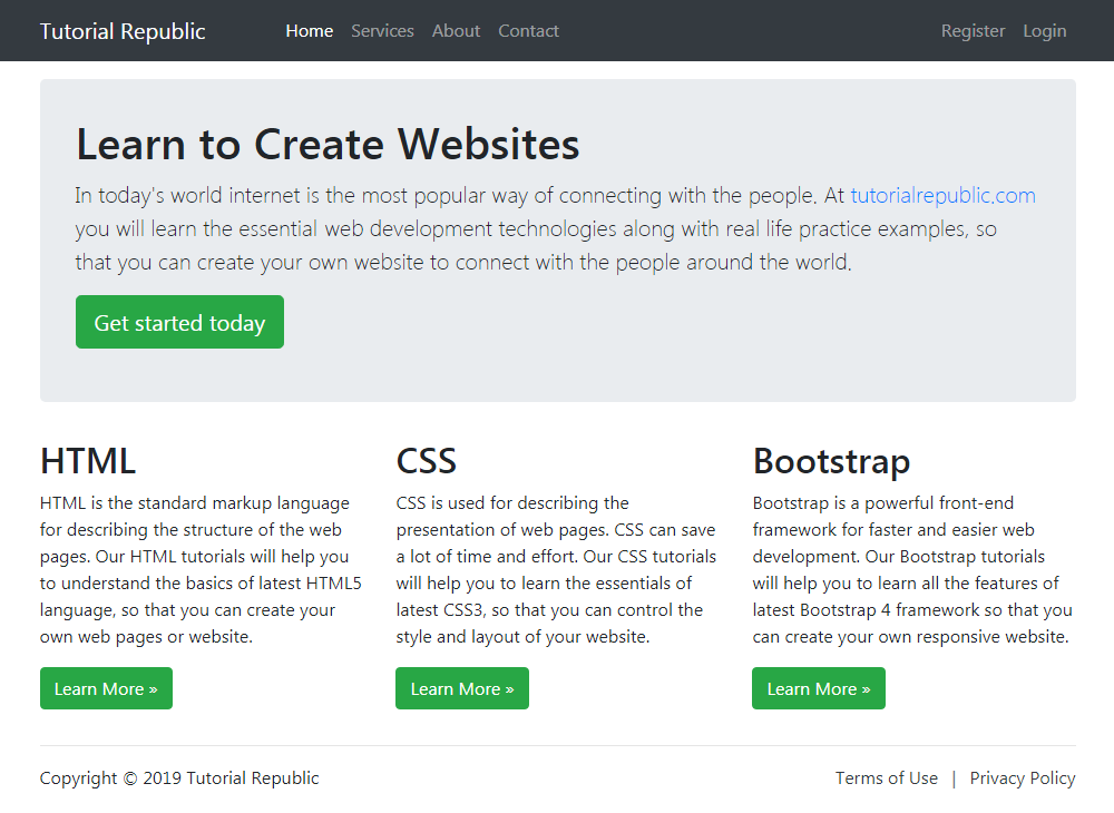
以下示例在屏幕宽度大于或等于 768 像素(如平板电脑)的中型设备上创建了一个 720 像素宽的固定宽度响应式布局,而在屏幕宽度大于或等于 992 像素的大型设备(如小型笔记本电脑)上为 960 像素宽 ,并且在屏幕宽度大于或等于 1200 像素(如桌面)的超大型设备上为 1140 像素。
但是,如果设备的视口宽度小于 768 像素但大于或等于 576 像素,则布局将为 540 像素宽。 对于小于 576px 的视口宽度,布局将覆盖 100% 的宽度。 此外,列将垂直堆叠 导航栏在这两种情况下都会折叠。
<!DOCTYPE html>
<html lang="en">
<head>
<meta charset="utf-8">
<meta name="viewport" content="width=device-width, initial-scale=1, shrink-to-fit=no">
<title>Bootstrap 4 Fixed Layout Example</title>
<link rel="stylesheet" href="css/bootstrap.min.css">
<script src="http://code.jquery.com/jquery-3.3.1.min.js"></script>
<script src="js/bootstrap.min.js"></script>
</head>
<body>
<nav class="navbar navbar-expand-md navbar-dark bg-dark mb-3">
<div class="container">
<a href="#" class="navbar-brand mr-3">Tutorial Republic</a>
<button type="button" class="navbar-toggler" data-toggle="collapse" data-target="#navbarCollapse">
<span class="navbar-toggler-icon"></span>
</button>
<div class="collapse navbar-collapse" id="navbarCollapse">
<div class="navbar-nav">
<a href="#" class="nav-item nav-link active">Home</a>
<a href="#" class="nav-item nav-link">Services</a>
<a href="#" class="nav-item nav-link">About</a>
<a href="#" class="nav-item nav-link">Contact</a>
</div>
<div class="navbar-nav ml-auto">
<a href="#" class="nav-item nav-link">Register</a>
<a href="#" class="nav-item nav-link">Login</a>
</div>
</div>
</div>
</nav>
<div class="container">
<div class="jumbotron">
<h1>Learn to Create Websites</h1>
<p class="lead">In today's world internet is the most popular way of connecting with the people. At <a href="http://www.qyoo.cn" target="_blank">qyoo.cn</a> you will learn the essential web development technologies along with real life practice examples, so that you can create your own website to connect with the people around the world.</p>
<p><a href="http://www.qyoo.cn" target="_blank" class="btn btn-success btn-lg">Get started today</a></p>
</div>
<div class="row">
<div class="col-md-4">
<h2>HTML</h2>
<p>HTML is the standard markup language for describing the structure of the web pages. Our HTML tutorials will help you to understand the basics of latest HTML5 language, so that you can create your own web pages or website.</p>
<p><a href="http://www.qyoo.cn/html-tutorial/" target="_blank" class="btn btn-success">Learn More »</a></p>
</div>
<div class="col-md-4">
<h2>CSS</h2>
<p>CSS is used for describing the presentation of web pages. CSS can save a lot of time and effort. Our CSS tutorials will help you to learn the essentials of latest CSS3, so that you can control the style and layout of your website.</p>
<p><a href="http://www.qyoo.cn/css-tutorial/" target="_blank" class="btn btn-success">Learn More »</a></p>
</div>
<div class="col-md-4">
<h2>Bootstrap</h2>
<p>Bootstrap is a powerful front-end framework for faster and easier web development. Our Bootstrap tutorials will help you to learn all the features of latest Bootstrap 4 framework so that you can easily create responsive websites.</p>
<p><a href="http://www.qyoo.cn/twitter-bootstrap-tutorial/" target="_blank" class="btn btn-success">Learn More »</a></p>
</div>
</div>
<hr>
<footer>
<div class="row">
<div class="col-md-6">
<p>Copyright © 2019 Tutorial Republic</p>
</div>
<div class="col-md-6 text-md-right">
<a href="#" class="text-dark">Terms of Use</a>
<span class="text-muted mx-2">|</span>
<a href="#" class="text-dark">Privacy Policy</a>
</div>
</div>
</footer>
</div>
</body>
</html>— 上面示例的输出将如下所示:
We've used the margin utility classes such as .mb-3, .ml-auto, mx-2 etc. to adjust spacing between the elements. Whereas the classes .text-dark, .text-muted, .text-md-right are text utility classes to adjust color and alignment of text. You'll learn about them in later chapters.